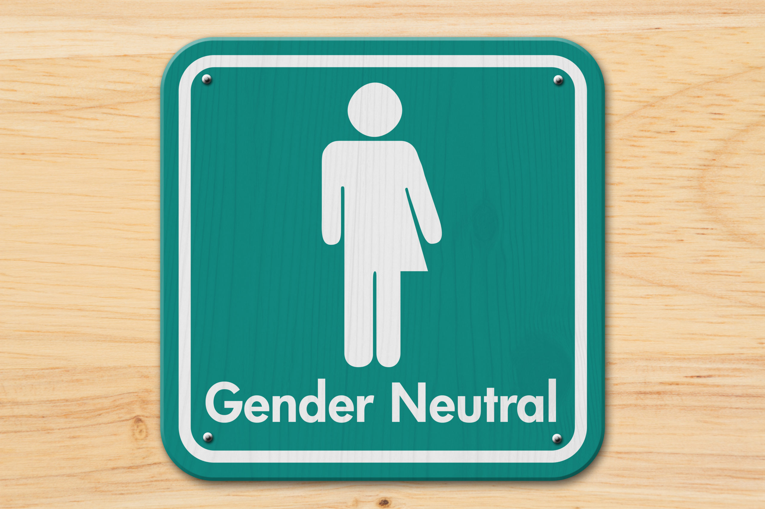
Popping to the loo has become an issue. Public toilets have become a focal point of attention for the myriad issues surrounding gender identity and trans individuals’ access to sex-segregated facilities.
In the US the right of transgender people to use toilets of their choice has been highly controversial. In 2015 Stalled! was launched in a bid to tackle the issue of transgender access to public restrooms and the need to create safe, sustainable and inclusive public restrooms for everyone regardless of age, gender, race, religion and disability. It shifted the terms of the debate by treating it as a challenge that can be addressed through design alternatives that do not accept sex-segregated bathrooms as a given. It stated its mission as: the creation of viable economical restroom prototypes for retrofit and new construction projects that can be adopted and deployed across the United States.
Beyond concerns for the transgender community, Stalled! also tackled problems faced by breastfeeding mothers, those needing to administer medication or perform religious rites, and people with physical or mental disabilities. The creators believe that the needs of all of these groups can be catered for through considered design decisions.
It issued a set of guidelines for designing inclusive bathrooms for public buildings (in the USA). The open-source, design-research project provides information and prototypes for creating safe and inclusive toilets that can be used by all.
Rewiring our thinking
One of the founders of Stalled!, Joel Sanders, an architect, took the issue further and in 2018 he started MIXdesign, a consulting firm aiming to re-imagine architecture by considering people of all genders, races, and abilities. MIXdesign will apply inclusive design principles to help clients (such as universities, museums, and corporations) through educational workshops, project advising, and in some cases, architectural services.
The default user of architecture which is transmitted in building codes, architectural guidelines and even in education is basically a youthful, healthy, able-bodies, cisgender, white citizen"
Joel Sanders, founder of STALLED! and MIxdesign
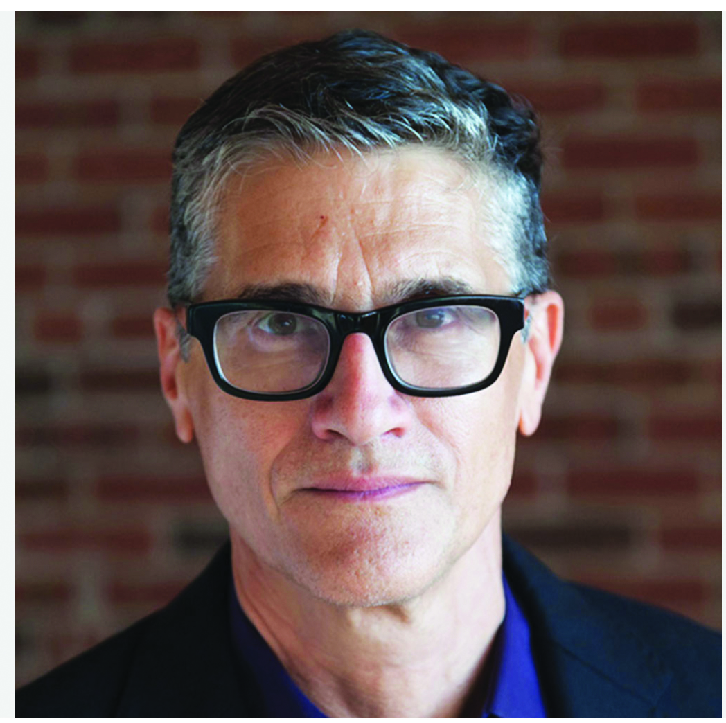
“The default user of architecture, which is transmitted in building codes, architectural guidelines, and even in architectural education, is basically a youthful, healthy, able-bodied, cisgender, white citizen,” Joel Sanders said in an interview at the time. “When you say ‘gender and architecture’, people often scratch their heads, but I think architecture is helping us define and perform our identities,” he added.
Depending on the audience, responses to inclusive design can be, well, mixed. One issue Sanders notes is money — people are concerned that designing for diversity will come at a cost. Using the gender-neutral bathroom example, Sanders argues that getting rid of binary restrooms can be space-saving and competitively priced, or even less expensive.
There’s also the psychological discomfort to worry about. “Designing for inclusion asks us to call into question our ideas of what is normal and abnormal, appropriately male and female. These are things that are culturally ingrained and can make people feel uncomfortable,” says Sanders. As for the future of inclusive design, Sanders compares the movement to where sustainable design was 15 years ago. “What people thought was a stretch and something that would be burdensome and expensive is something that we have now increasingly realised is important and are conscious of,” he says.
“When designers begin a project, they inevitably begin to think, ‘Who are my users, what kind of bodies am I dealing with, and how do I design for difference?’” says Sanders. “I think that just needs to become wired into the thought process.”
Also in 2018 a Royal College of Art graduate in the UK developed a digital tool that calculated the underlying gender bias in English architecture, to help create more gender-neutral environments.
Hannah Rozenberg’s graduation project, ‘Building Without Bias: An Architectural Language for the Post-Binary’, centres on an online calculator that allows you find out whether a building is biased or not, and helps you to add or subtract elements to improve the balance.
The designer started the project after discovering the link machines make between architectural space and gender. Imagining a future where buildings are created using algorithms, Rozenberg wanted to find a way to highlight the gender biases embedded in architectural terms learned by technology, to make it easier to produce “post-gender architecture”.
As automated technology finds its way into our bodies, buildings and cities, it is essential that it be designed in a way that is free from insidious biases"
Hannah Rozenberg
“As automated technology finds its way into our bodies, buildings and cities, it is essential that it be designed in a way that is free from insidious biases,” she said.
A word entered into Rozenberg’s website Building Without Bias returns a ‘gender unit’, or GU. The higher the GU value, the more feminine the term is perceived by machines.
Rozenberg found architect, steel, cement and screw among the most male terms, while tearoom, kitchen and nursery were among the most female. As part of her project, Rozenberg has used it as the starting point for five gender-neutral structures: a cinema, a theatre, a library, a sheltered bench and a newspaper office.
Rozenberg developed a set of formulae to determine the overall gender of architectural spaces based on the values of their components. The spaces she proposes all have a reading of zero GU – neither male nor female.
Separation anxiety
Fast forward to this year and the UK government has been under fire for its consultation on desegregated toilets – entitled ‘Toilet Provision for Men and Women: Call for Evidence’. It has been criticised as a direct attack on trans rights by the United Voices of the World – Section of Architectural Workers union. “The Government’s current consultation on toilets places the provision of ‘gender-neutral’ desegregated facilities and the safety of trans and gender non-conforming people who rely on them, under threat,” the union argued in a critique in Dezeen. The consultation, which ended in February, says that its aim is to “ensure that everyone is fairly served”, and claims that desegregated facilities place women at a “significant disadvantage” and make them “feel less comfortable”. It further seeks to reconsider “the ratio of female toilet spaces needed, versus the number for men” and pushes for the use of “gender-specific language” in washroom signage to avoid so-called “public confusion”.
The union argues this begs the question as to who its authors do and do not consider ‘women’.
The union has called on architects to use their voices and stand in vocal opposition to the Government’s segregated toilet proposals. “Desegregated toilets are known to offer numerous benefits – they introduce parity into waiting times for all genders, make toilet trips easier for carers or those accompanying dependents, are cheaper, and use space more efficiently. They have proven particularly successful in schools where they can help to reduce bullying.
“In 2017 UK LGBTQ+ rights charity Stonewall found that 48 per cent of trans people don’t feel comfortable using public toilets due to fear of discrimination or harassment. A huge benefit of desegregated toilets is that they can greatly reduce the risks of verbal harassment, intimidation and physical assault transgender, non-binary and gender non-conforming people often face in ‘single-sex’ facilities.”
A concerned coalition of architectural academics based at the Bartlett School of Architecture and Goldsmiths Centre for Research Architecture, also criticised the consultation: “The Government’s consultation is based on false premises of binary gender and biological essentialism, which do not reflect the actual diversity of bodies and experiences. It disregards the needs of certain users, including trans, intersex and gender non-conforming people, who are especially vulnerable to harassment and violence in public facilities. It raises the question: why should toilets continue to be divided by gender at all, given that users’ needs are known to be shaped by many factors (age, health, ability, gender, caring responsibilities, race, religion, sex and sexual orientation)?”
Changing signage is one of the simplest and least expensive ways to make facilities more gender-inclusive (see box right). GAI members would do well to be aware of this burgeoning issue and equip themselves with knowledge and supplier details such as specialist fabricators like Davis Architectural Services Ltd and Weldit.
But to go further, the challenge to architects is: what other ways can spaces becomes more gender-inclusive?
Read the signs
One key design solution to the issues surrounds signage. In the US and Canada a gender neutral toilet sign stating ‘We Don’t Care’ was adopted in various public buildings. Here in the UK earlier this year Margaret Middleton, exhibit designer and queer museum consultant, took to Twitter to promote the idea of inclusive signage. Margaret writes and speaks about making museums more queer-inclusive and gender equitable spaces. They describe themselves as “working at the intersection of design and social justice”. They are often asked to consult on signage and icons.
“The goal of gender-inclusive signage is to make the facility as welcoming as possible by avoiding gender stereotypes, acknowledging transgender people including nonbinary people, and wherever possible, not reinforcing a gender binary,” they told AIJ. Here they offer their top recommendations for simple signage swaps to make signage more gender-inclusive.
The best gender-inclusive signage puts focus on the facility or utility, not the user:
- All-gender toilet: While specially built all-gender toilet facilities are becoming more popular, any single stall toilet can be labeled an all-gender toilet. For non-sex-specific toilets, I suggest using an icon of a toilet instead of the more common icon depicting both a man and a woman. I recommend that the accompanying text be ‘All Gender Toilet’ instead of ‘Gender Neutral Toilet’ or ‘Unisex Toilet’ because the ‘All’ is an actively welcoming word that acknowledges there are more than two genders.
- Baby care: Instead of an icon of a woman bending over a table with a baby on it, I recommend an icon of a baby wearing a diaper. This puts emphasis on the baby instead of the carer, avoiding the implication that only women would be interested in using a baby care station. Baby care stations should be welcoming and available to people of all genders and abilities.
- Nursing: To combat stigma and reassure their nursing guests, many facilities will use signage to actively welcome breastfeeding on their premises. This is a very positive practice and it can be made even more inclusive by using an icon that does not gender the nursing adult and using the term ‘nursing’ instead of ‘breastfeeding’. Some transgender men and some nonbinary parents choose to feed their babies with their bodies but do not identify with the term ‘breastfeeding’.
Not everyone will relate to the term ‘nursing’ either.
- Elevator: Put emphasis on the function of the elevator, not its riders by using an icon with up and down arrows instead of an icon depicting a man and woman inside a box. Not only is this more literal, it is less confusing. I am sure I am not the only one who has mistaken this icon for a toilet icon on a map!
- Menstrual supplies: In the toilet, the dispensers and disposals meant for menstrual supplies often have vague icons on them, usually a little box with a Venus (female) symbol on it. A simple icon of a menstrual pad and a tampon is more straightforward and does not gender the products. Similarly, labeling them ‘pads and tampons’ is more inclusive than the popular euphemism ‘feminine hygiene’. Dispensers and disposals should be available in all restrooms including men’s toilets because some transgender men menstruate.
Image credit: Matthew Clowney


